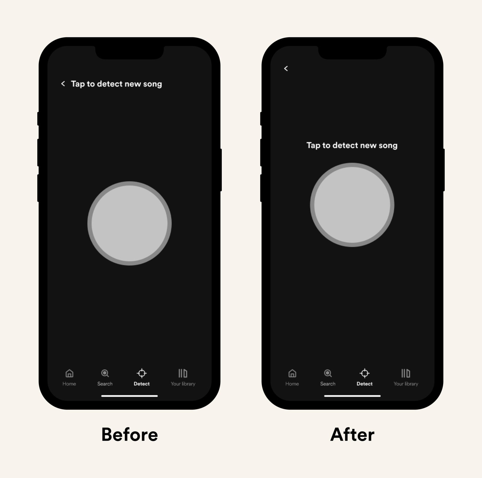
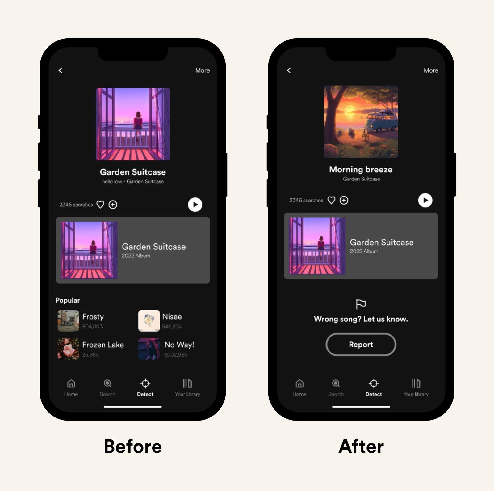
Integrating a feature into an existing product is a complex process. It requires thinking about where this feature will be placed, what it will look like, how it will be introduced to users, and many other questions. While I didn’t have time to work on introducing the feature through Spotify’s onboarding process, I took the time to assess all the other questions properly.
Following existing product guidelines ensures that the new feature flows seamlessly. Taking the time to outline the end goal while staying aligned with user needs is equally important.
However, my most important lesson was recognizing when less is more. I was often tempted to add as many things to my screens as possible, but this would only overwhelm users, who would end up not completing their tasks and becoming distracted by other elements. As a result, minimizing the offer on my screens was the right decision.
From a technical point of view, this feature type requires a lot of work. Reaching the desirable song accuracy—regardless of how much noise there may be around—and maintaining that capacity over time requires plenty of resources. This is why it’s imperative to always stay in touch with the tech and design within the agreed parameters.
What should be improved?
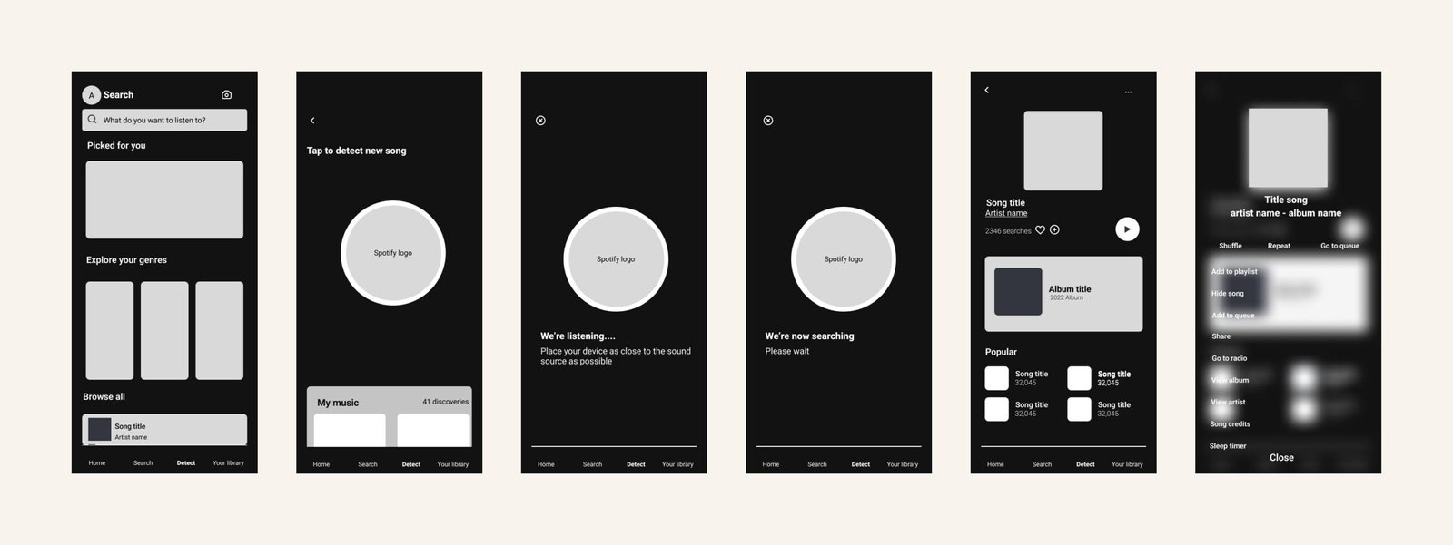
- I suggest improving the detection button by animating it when it searches for songs; combined with ongoing feedback through text, this would keep the users even more engaged.
