1. User research - to understand how people interact with the current website and use other task management tools.
2. Competitive research - I analyzed the website structure and offerings of top competitors, such as Trello, Asana, and Notion.
3. Website navigation - introducing new pages and rethinking the entire website structure.
4. Wireframing - showcasing the new flows through low-, mid-, and high-fidelity wireframes.
5. Interactive prototype - creating an interactive prototype for the new flows.
6. Usability testing - evaluating ease of navigation and overall website structure and content, then iterating based on feedback.
This project aims to give KanbanFlow a fresh look and improve users' website navigation. At the user level, the primary goals are:
At a business level, the redesign of the website will:
The website is not getting enough traffic and is swallowed by top competitors like Trello, Asana or Notion.
I have conducted comparative and competitive research and user interviews to understand how people use task management software, the challenges they face , and what they're most interested in. The stories that were collected became a strong foundation for the insights below.
Method: Zoom calls
The interviews aimed to help me understand whether and how people research and use task management tools and what they're looking for in a website before deciding whether to use a tool. Some of the questions were centered around:
I conducted competitive research and user interviews to understand how people , the challenges they face, and their motivations. The stories I collected became a strong foundation for the insights below.
Expose KanbanFlow to a wider relevant audience that will ensure a significant increase in qualified organic traffic and conversions.
By refreshing the visual identity and the website's user experience, we can add new sections that will be more relatable to potential users.
I placed all features into separate categories, based on urgency level, then went on to further prioritise those that needed to be displayed in the final flow.
To deliver the goals mentioned above, I redesigned the entire homepage, updated the main menu to incorporate new website sections like use case pages under "Solutions,” and updated the entire pricing page and the sign-up process.
Once I understood the essential design elements, I incorporated them into detailed wireframes and iterated through multiple design versions in Figma based on feedback collected through testing.
I asked users to perform the following tasks:
Task success: 95% of participants reached the end screen.
Only one user had an issue accessing the dashboard screen and fully completing the flow. This was due to a technical error in the software I used for testing.
All other users encountered no issues in performing the tasks at hand. No further iterations were made.
Below, you can try out the final version of this project's interactive prototype.
This project helped me understand what redesigning a website means from a design perspective. So far, I have only considered the marketing side of things and the impact a redesign would have on various channels. Considering what's currently working for the website and what needs to be changed is a vital decisional process.
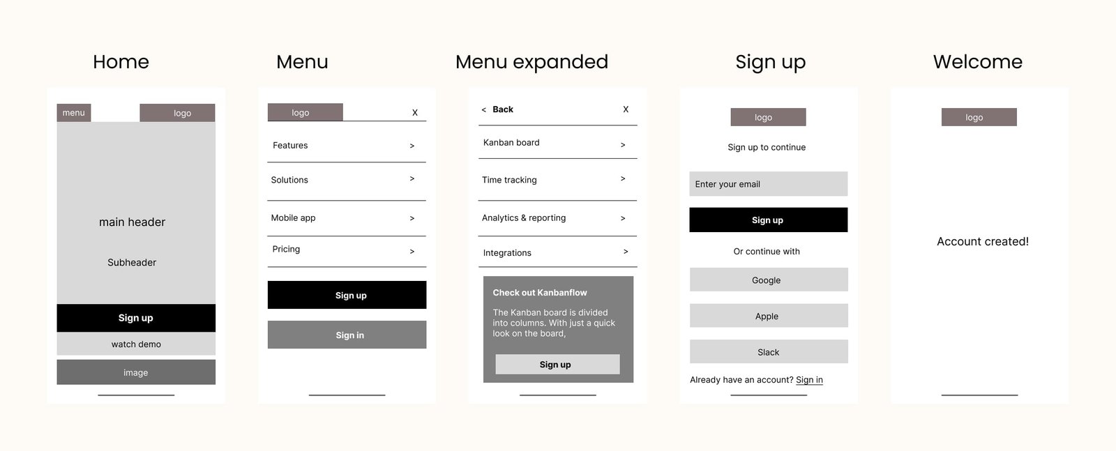
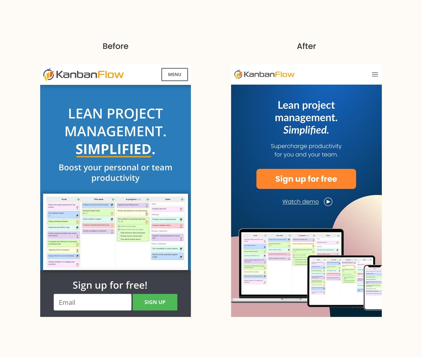
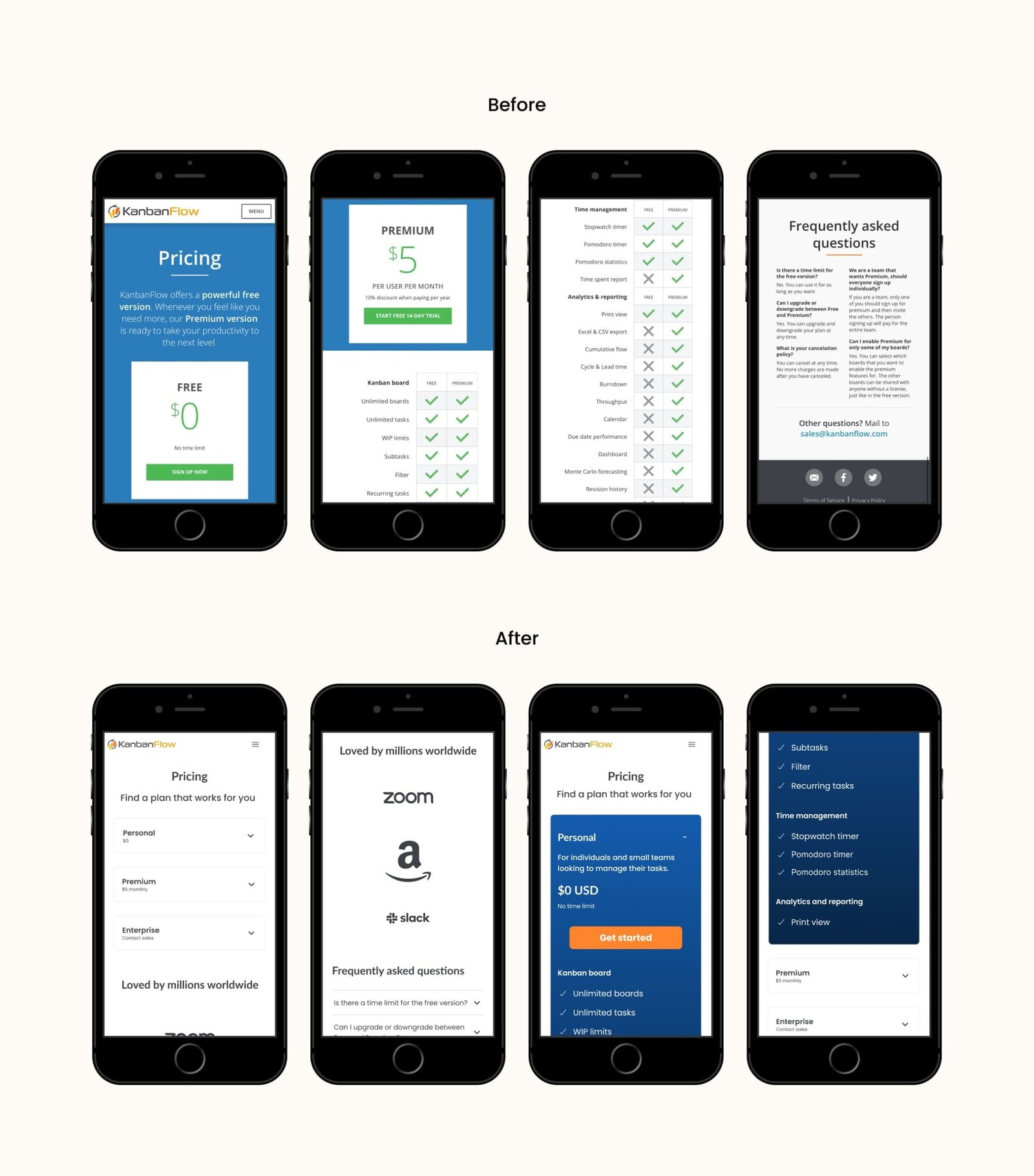
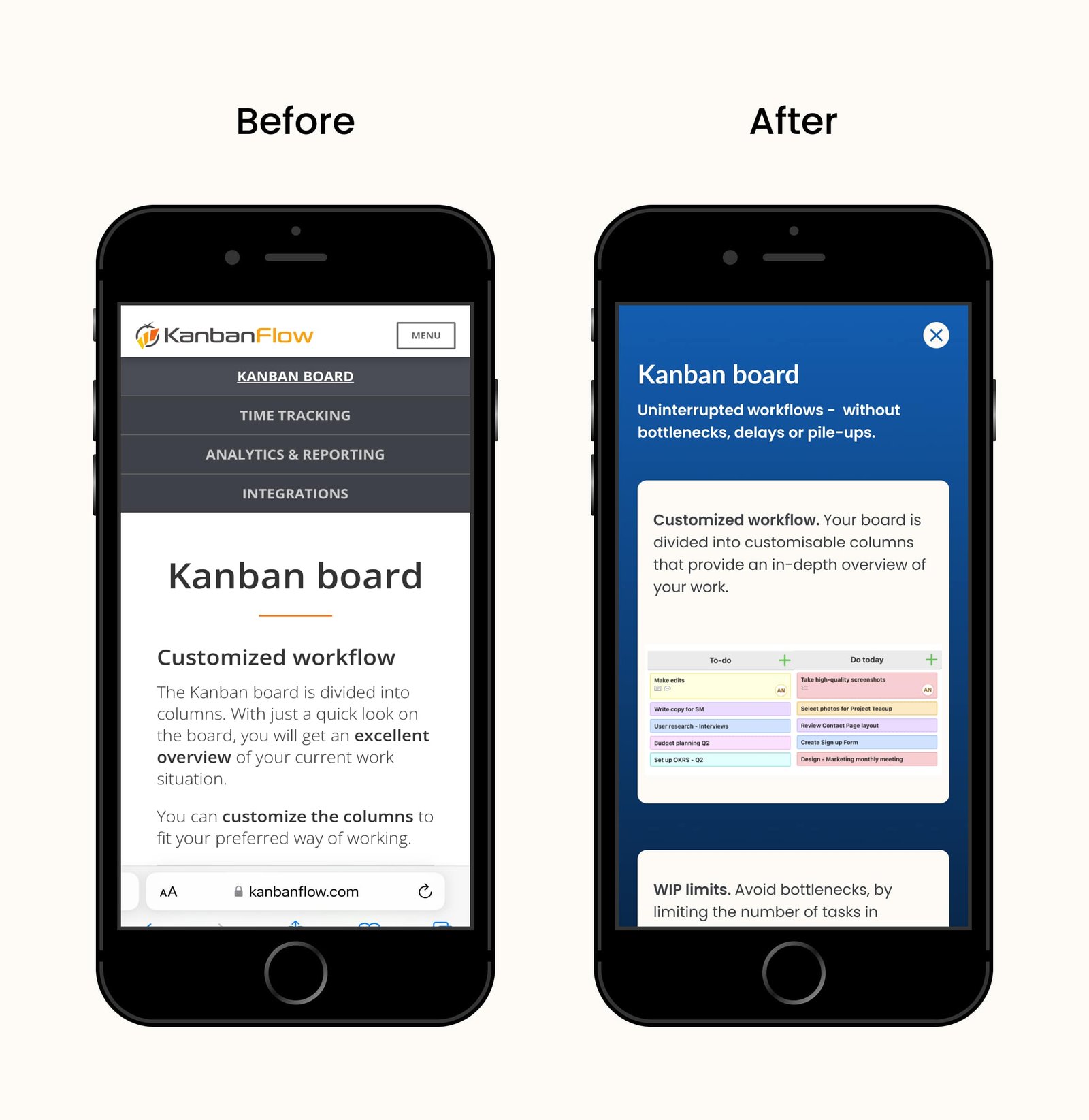
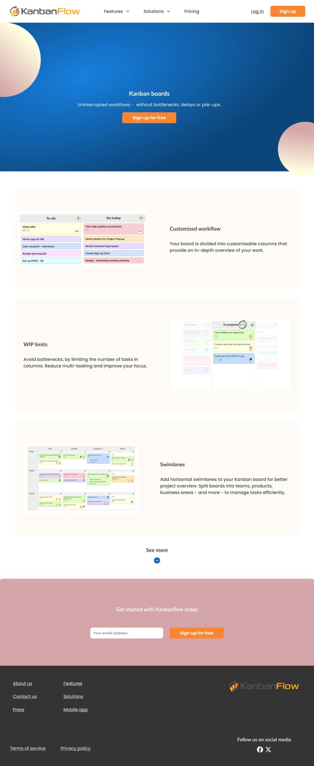
Considering all the information provided by the interviewees, I translated it into screens that empower users to have a seamless navigational experience and a pleasant UI experience.
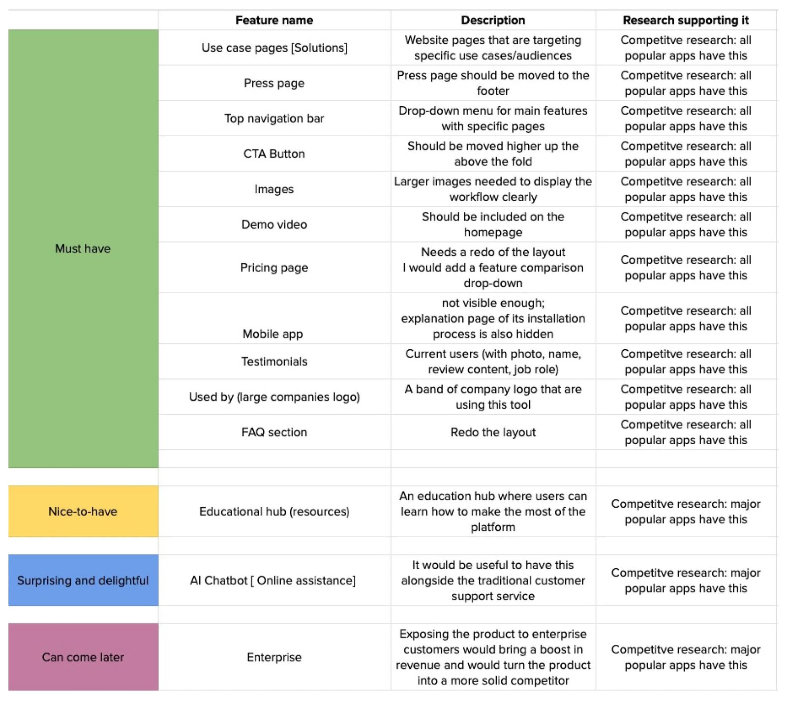
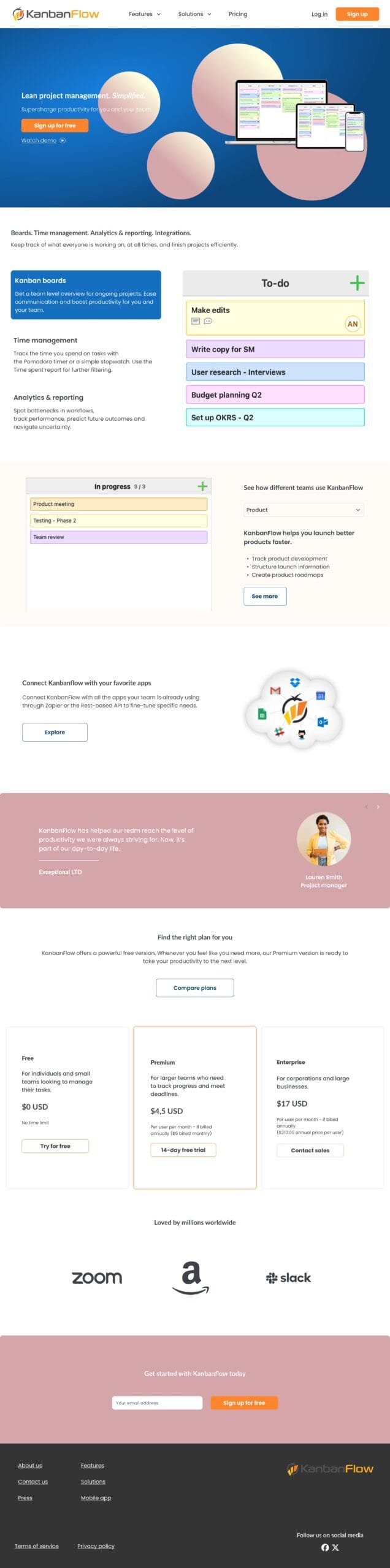
I also included a new website section, "Solutions," which would show the real-life audience this product addresses. This aspect was lacking in my research, so I had to operate based on assumptions.
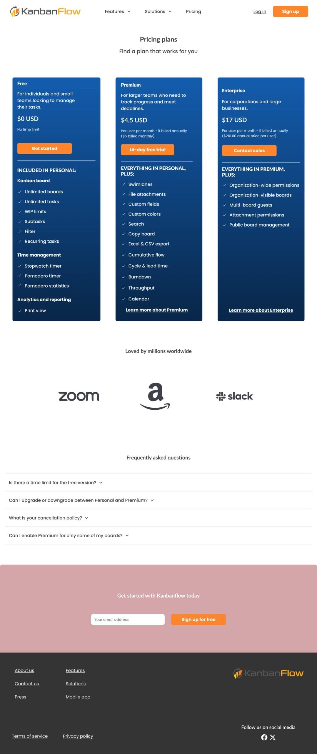
The new design also includes an Enterprise section—whether this would be feasible is a more extensive discussion. I aimed to increase future revenue, but from a technical point of view, significant security aspects, as well as sales and legal concerns, need to be completed first.
Biggest takeaways:
What should be improved: The current color palette is too strong; I would tone it down. I would increase the height of the top header and bring any icons and logo slightly lower on the page.