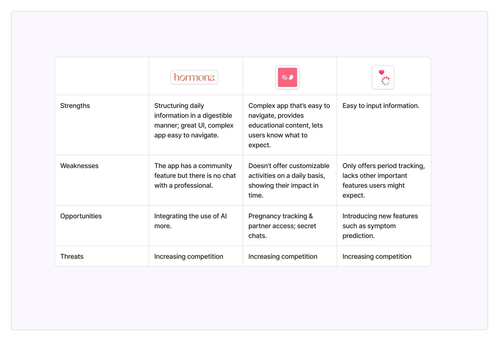
The main focus of this project – helping women gain control of their lives and learning how to navigate hormonal fluctuations – can be broken down into several goals:
Method: Zoom calls
These were some of the questions asked during the interviews:
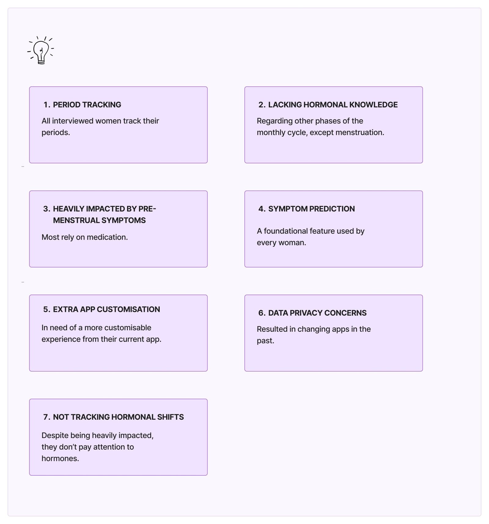
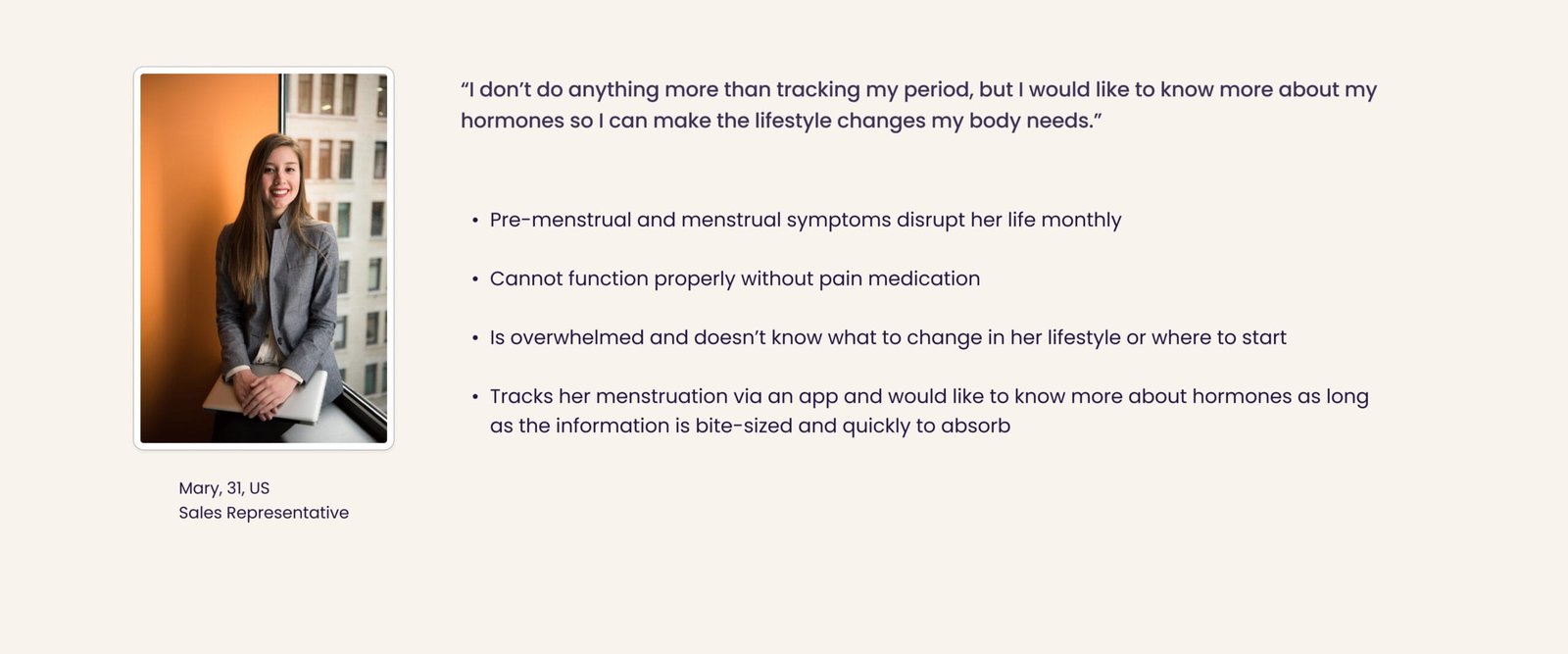
Women are unaware and don’t usually track hormonal shifts throughout the month, even though these changes heavily impact their lives.
Help women understand hormonal fluctuations in their bodies so they can navigate them more easily by adjusting their lifestyle.
Empower women to keep track of their daily symptoms so they can identify patterns and know what to expect.
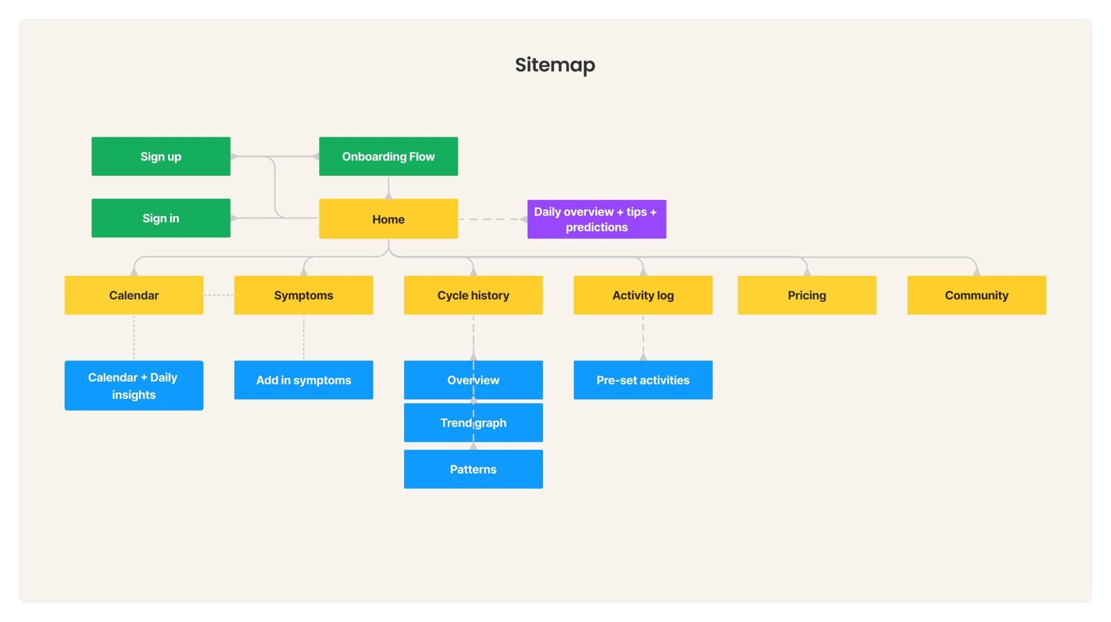
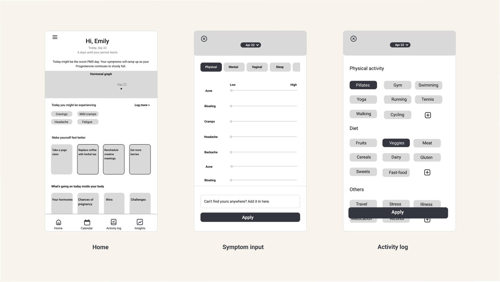
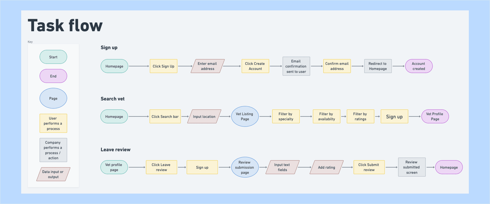
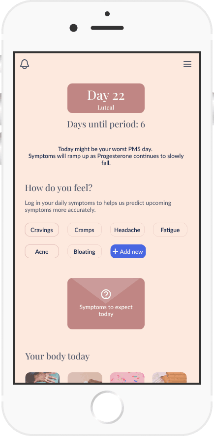
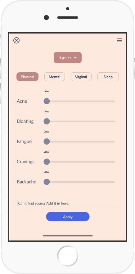
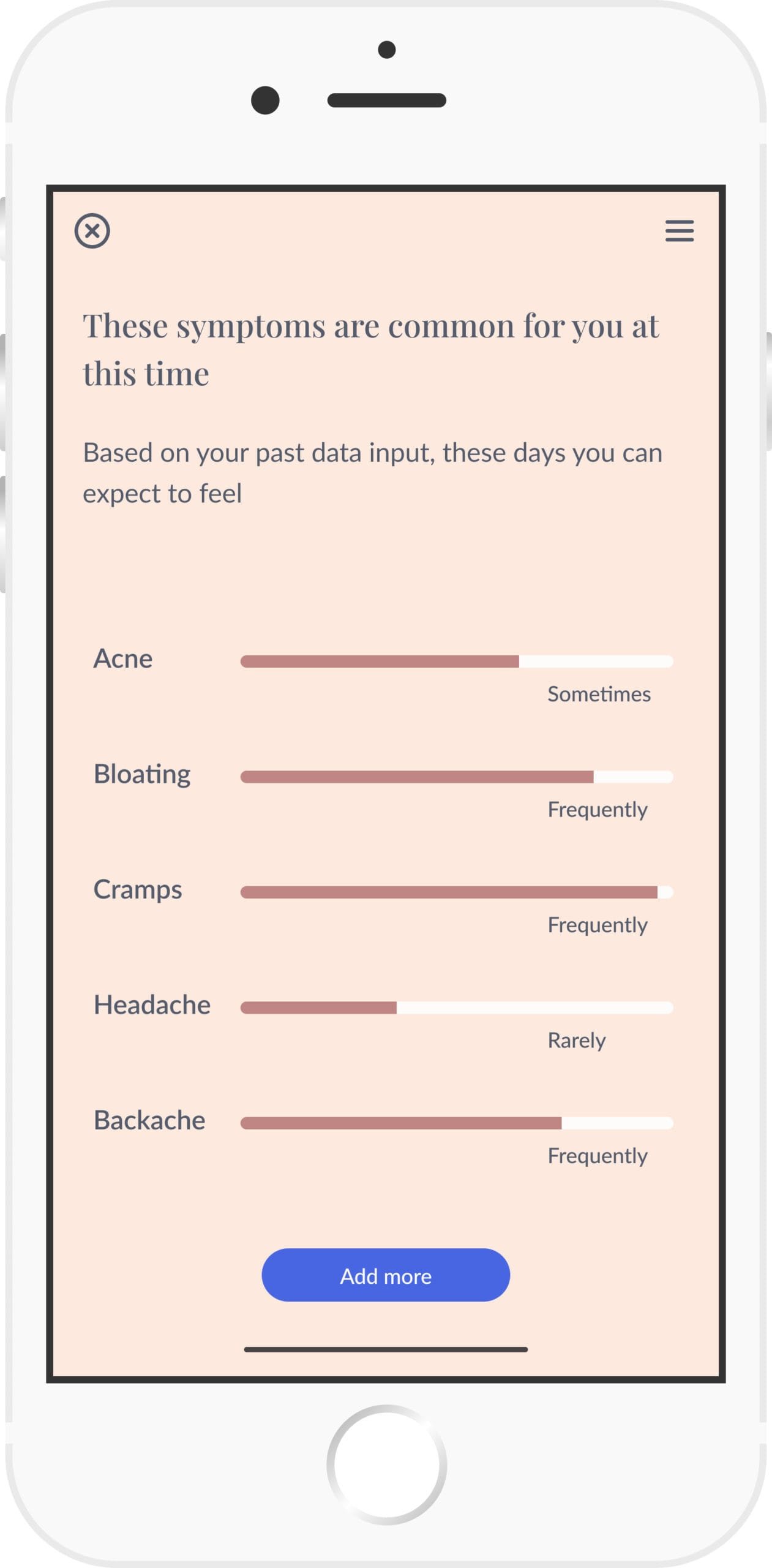
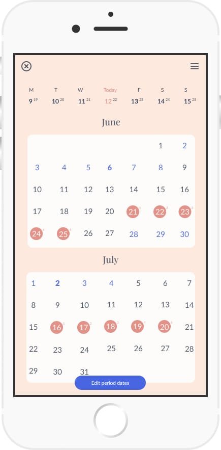
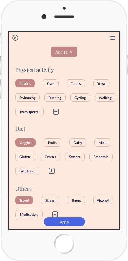
To understand how valuable potential users will find the platform, I asked testers to perform the following tasks:
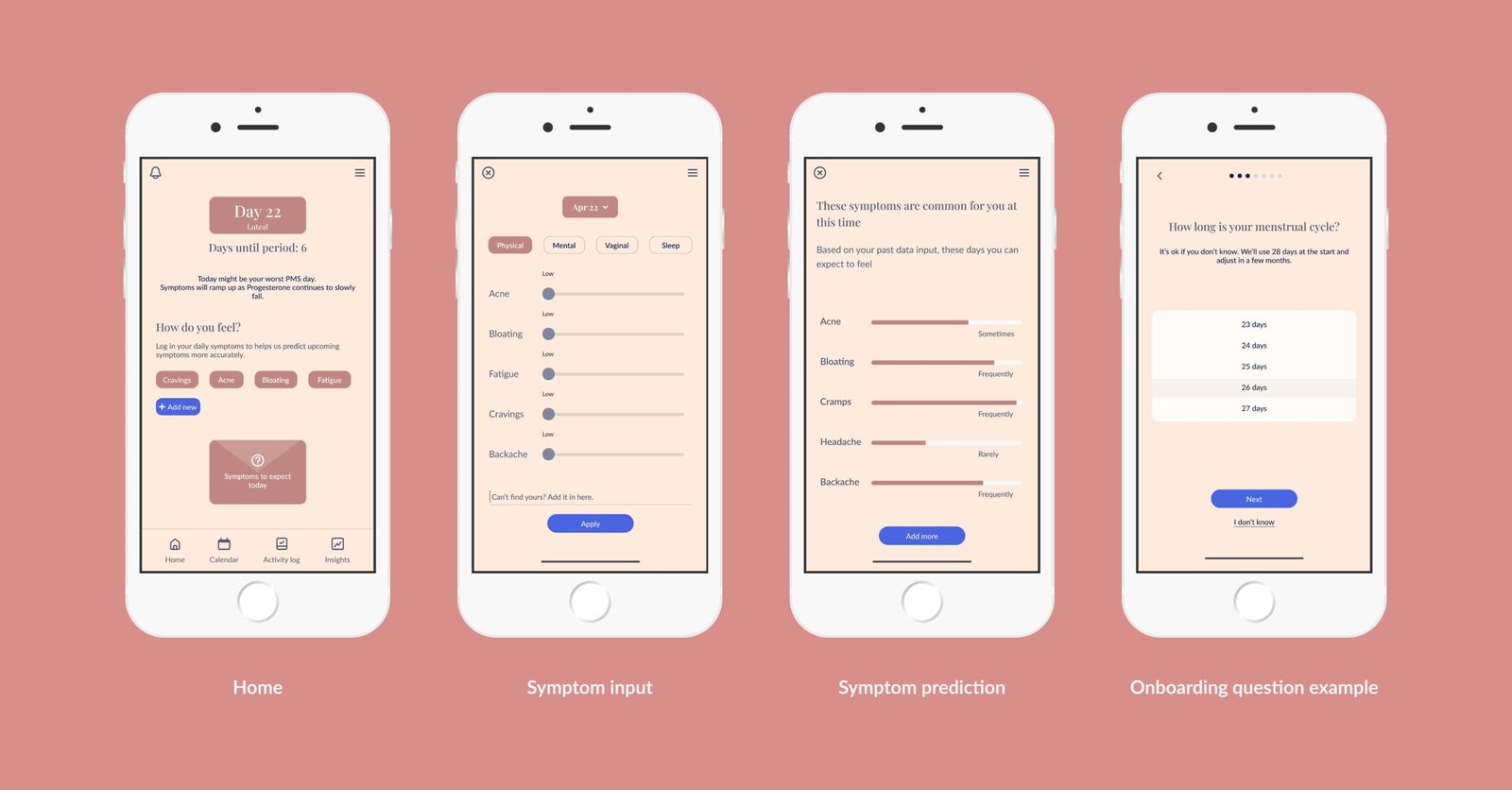
I chose these particular screens as they are central to ensuring the app offers accurate and timely information. To provide daily tips on navigating different times of the month, the user must have an account and input daily symptoms. Based on these, the app will predict upcoming symptoms and provide information on how to alleviate them. After receiving feedback for all my designs, I made iterations based on user testing findings.
1. Onboarding
Some users mentioned that the onboarding is too long and the questions asked are too personal. However, they then acknowledged that it was necessary for the app's accuracy. Nothing was changed in the onboarding.
2. Symptom input directly from the home screen
I would like to see the symptoms I add more prominently
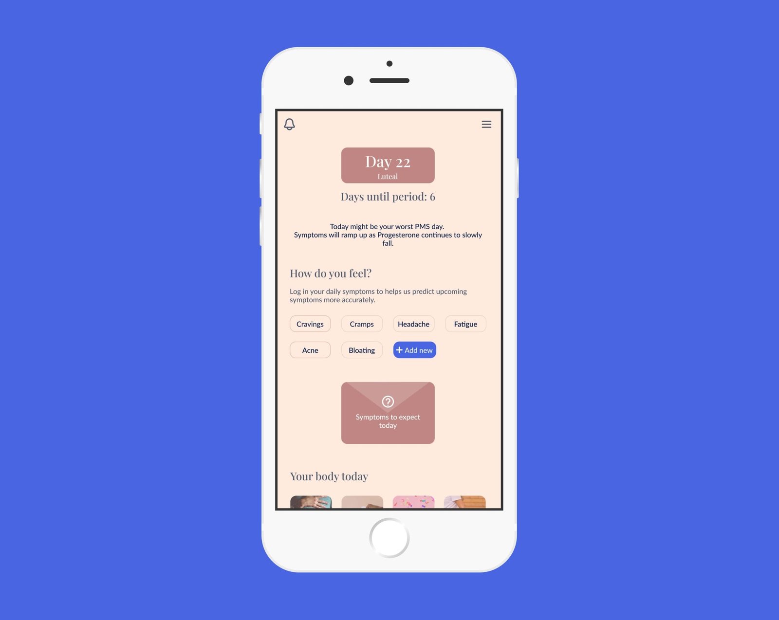
Users were frustrated because they couldn't see all the symptoms added at a glance. I changed the display of the symptoms and opted to show only the selected ones on the homepage. This removes frustration and helps the user focus on their input.
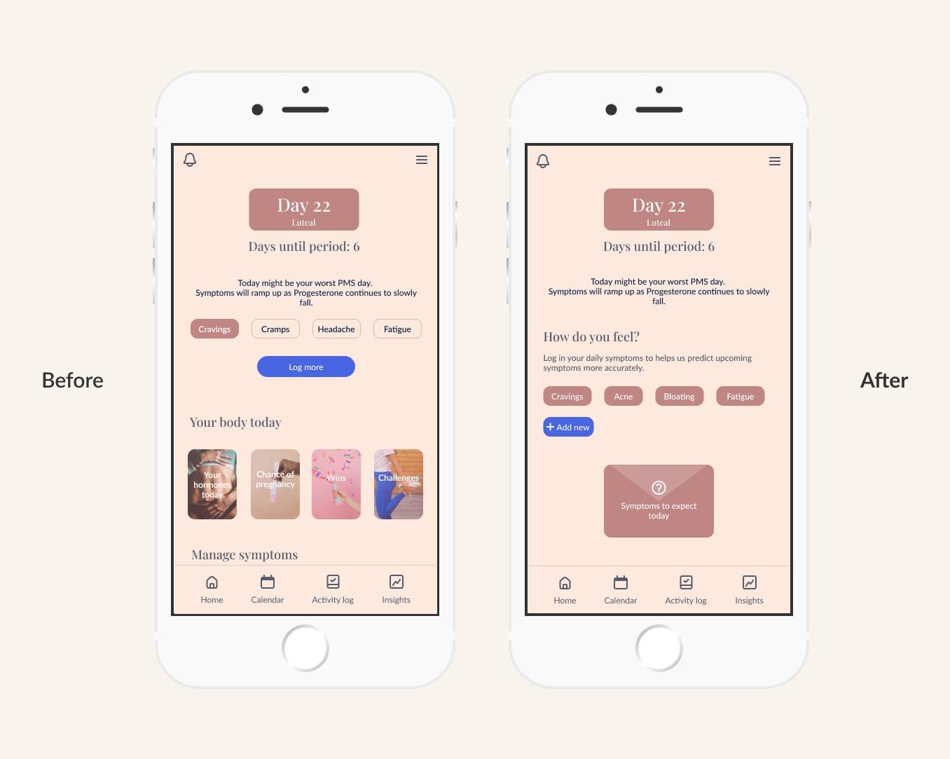
3. Symptom prediction
I would like to see a sample of the symptom prediction feature to get an idea of how that would work for me.
The symptom prediction wasn’t initially developed enough. I integrated it into the top part of the homescreen, as that would be among the first things a user would look for, and created a separate screen that illustrates the symptom prediction upon tapping.
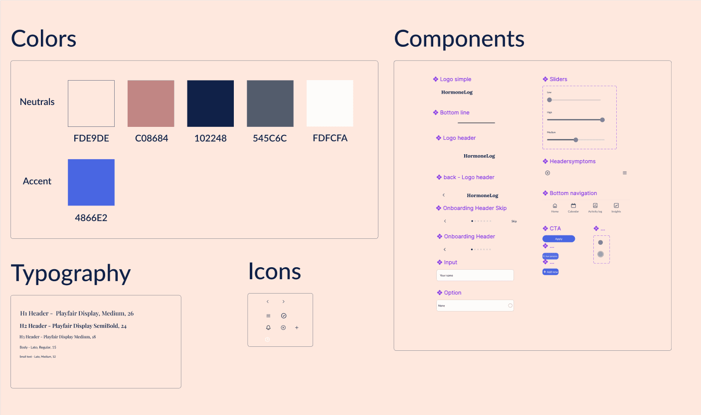
I chose a simple wordmark logo. HormoneLog is easy to navigate and get information from, which is why the logo functions as an extension of that simplicity.
For color palletes, I chose nudes that render softness and femininity, two values that align with my vision for this project. Only the CTA buttons are brightly coloured to ensure they stand out on any screen.
For typography, I chose a combination of two serif and sans-serif fonts. This way section headings stand out more, while the body text remains simple and tidy. The softness of the color pallets is deeply entwined with that of the heading font.
